COLOUR & MATERIALS
Why a neutral room can feel unfinished.
A quiet palette is a beginning, not a complete atmosphere. A room made of similar colours still needs relationships, variation and somewhere for the eye to rest.
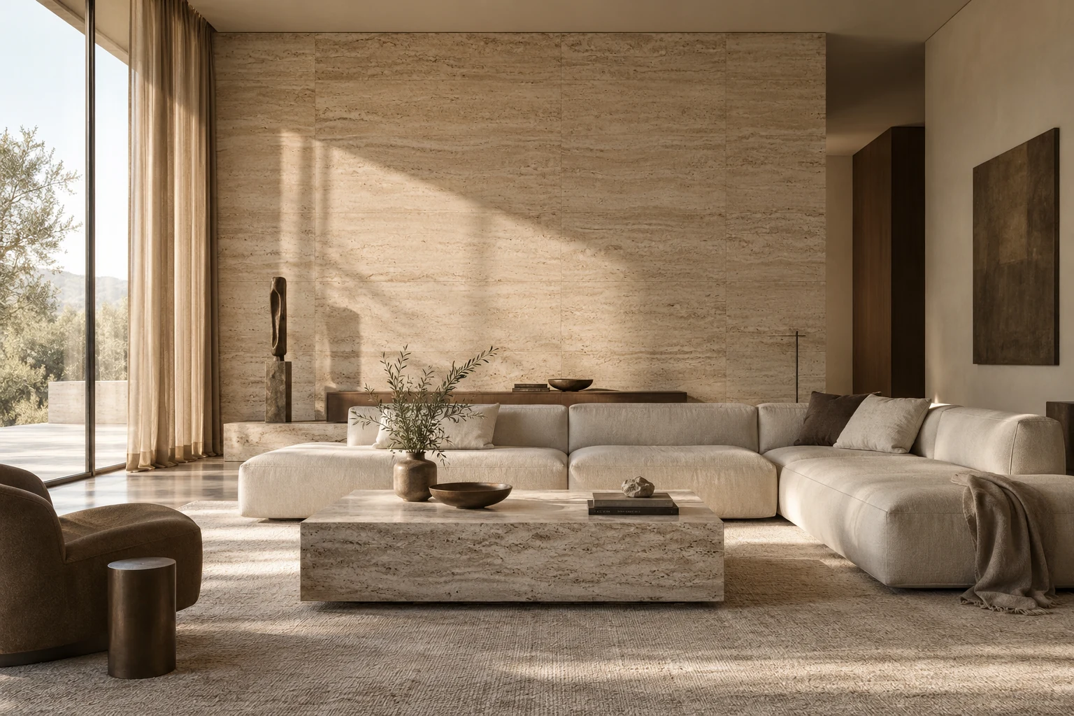
Look beyond the colour names.
Two materials described as beige can feel very different together. One may appear pink beside a stone floor; another may lean grey in the shade. The existing floor, the window light and the largest pieces of furniture all influence what you see.
Compare samples together in the room, rather than choosing each one separately from a screen. Move them between the areas where they will be used and look again later in the day. A small collection of real samples is often more informative than a large collection of reference images.
Give quiet colours different surfaces.
A woven fabric, a smooth ceramic and a timber grain can bring variation without introducing a strong new colour. This is especially useful when you want the room to feel restrained. The eye registers a difference, while the overall palette remains connected.
Texture should still make sense for your life. Think about touch, cleaning, the people or animals using the room and whether a delicate finish will feel enjoyable or demanding. The most beautiful material is not automatically the most comfortable choice to live with.
Introduce enough definition.
When everything sits at a similar lightness, the room can feel indistinct. A darker timber, a quiet outline or a more substantial piece of art can establish a point of reference. The amount of contrast can remain gentle; it just needs a reason to be there.
Scale contributes to that definition. Several small accessories may not give a large wall the presence it needs. Equally, an oversized feature can overwhelm a room that is intended to feel restful. Consider the relationship from across the room before deciding that the solution is more objects.
Leave something unresolved on purpose.
An empty stretch of wall or a clear surface can allow the neighbouring detail to be appreciated. Restraint works when the proportions around it feel considered. It feels different from a collection of undersized pieces spread thinly across the room.
Before adding colour, ask whether the missing ingredient is actually light, scale or a tactile contrast. Change one relationship at a time and live with it briefly. The aim is not to keep the room neutral at any cost; it is to understand what would make it feel more complete.
SOMETHING TO TRY AT HOME
- Compare samples beside your existing floor.
- Look for variation in texture and lightness.
- Try one purposeful change before adding a collection of accessories.
Talk about your space.
Bring it to a conversation. We can start with what isn’t working, or the feeling you want more of.
Start Your ProjectRelated insights
All Design Insights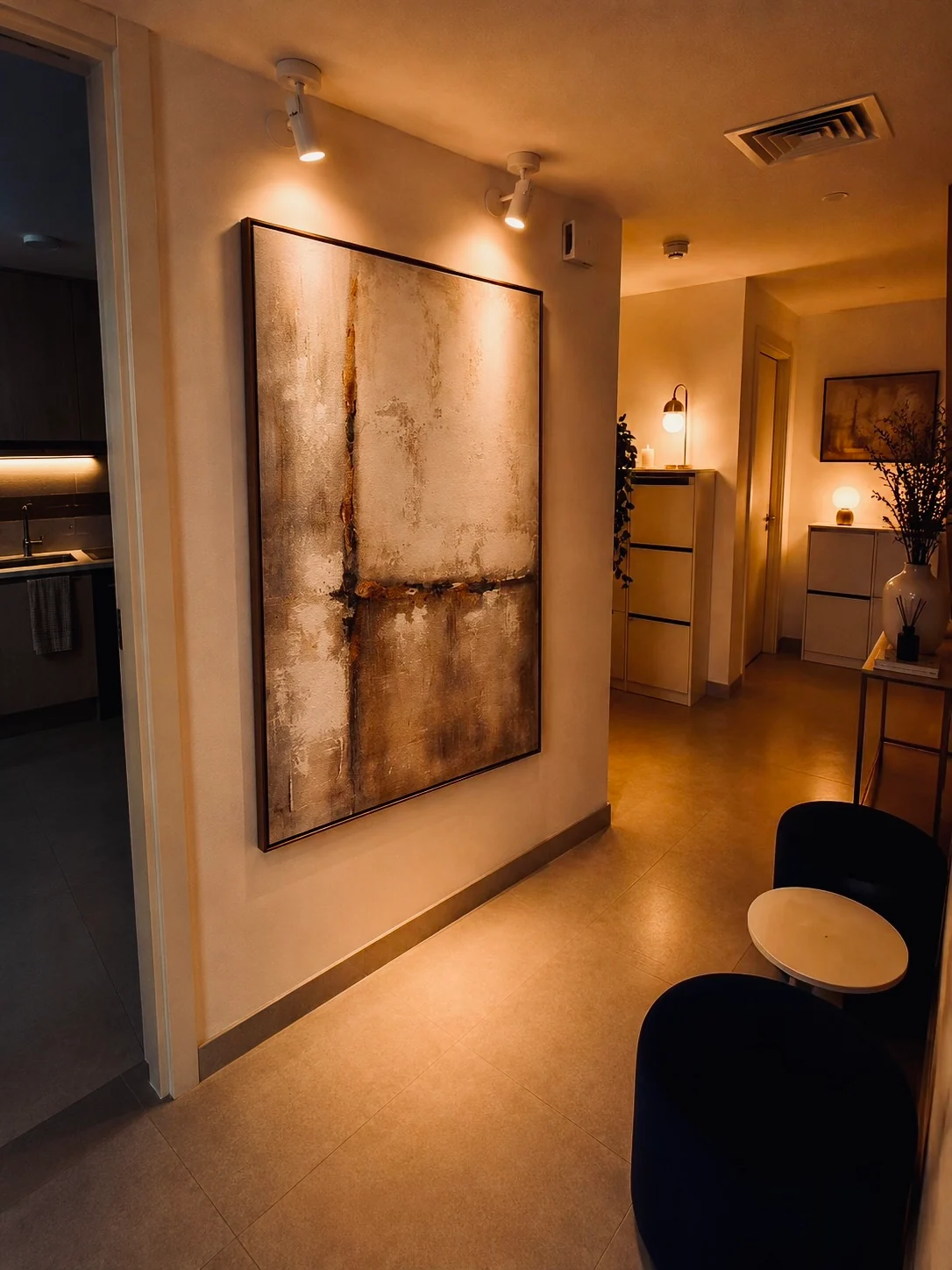
From a feeling to a room plan.
‘Calm’ is a useful intention. It becomes a design direction when we ask what calm would allow you to do, and what in the room is preventing it.
Read The Insight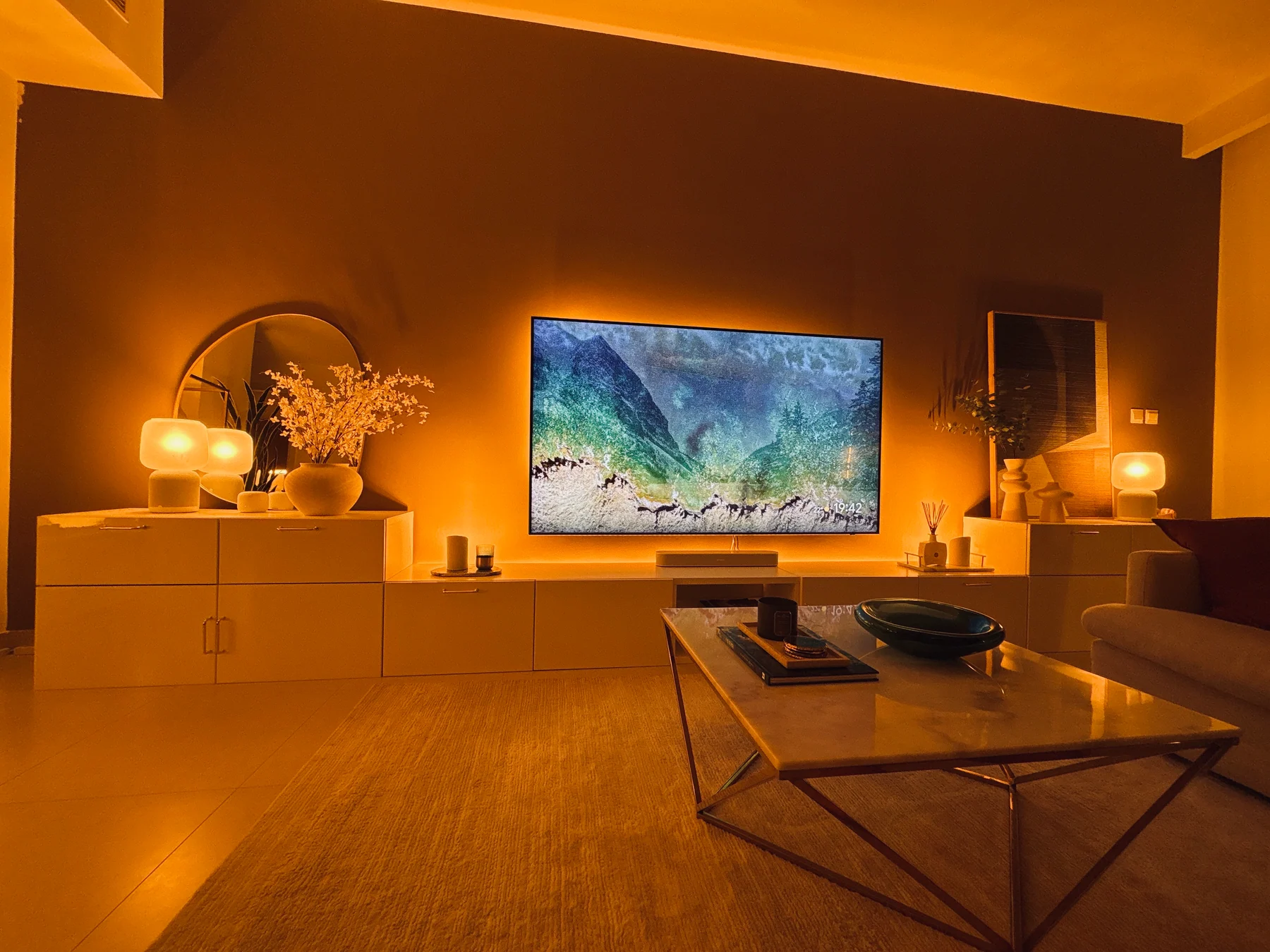
One Room. Two Moods.
A room does not have to feel the same at eleven in the morning and eight at night. Its light can follow the life happening inside it.
Read The Insight